Why Allium?
The Allium genus of plants includes onions, garlic, leeks, shallots, and scallions — some of the most important foundational elements of nearly every global cuisine.
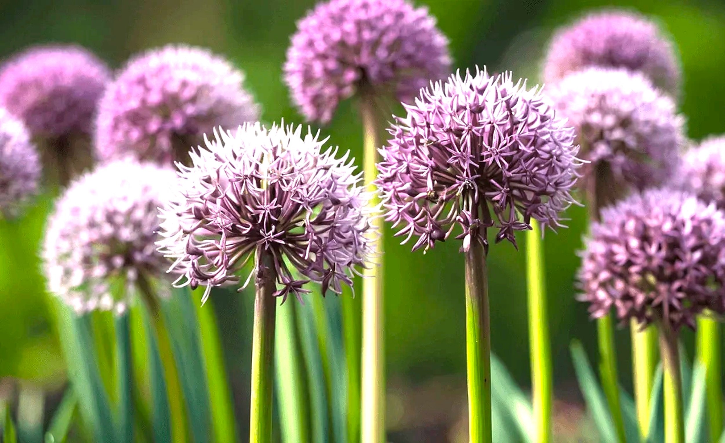
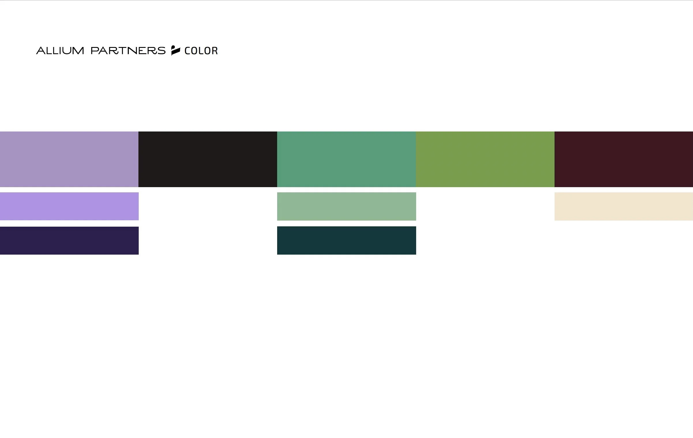
Alliums for the most part grow underground and play a background supporting role in dishes. You might not know they're there, but if you took them out, the dish would be lacking in flavor and structure. Alliums have a colorful streak, too — think of the bold purple of a flowering chive.
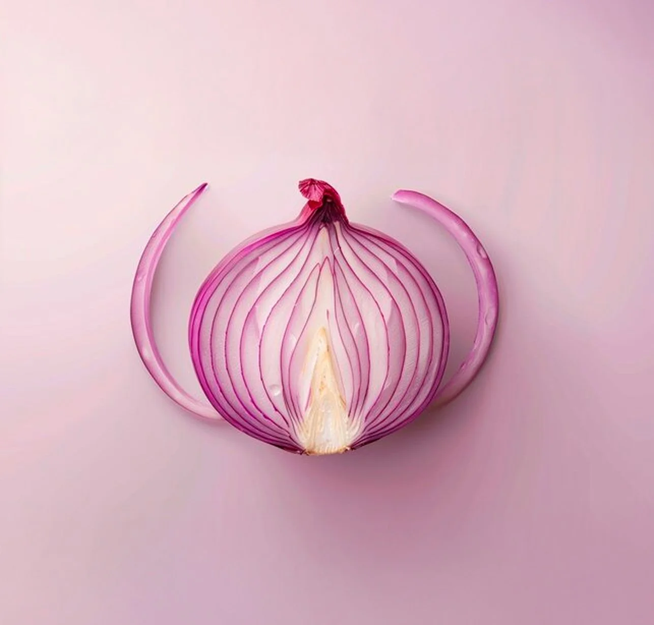
I chose Allium Partners as the name of my business for a few reasons. First, because my last name means "onion" in Italian. Second, I love eating and cooking, and mincing garlic and chopping onions feel like innate gestures by now. My favorite smell in the world is diced onion sautéeing in butter. Third, my consulting and coaching practice is a lot like alliums. I support my clients so their flavors — their goals, their values, their missions — shine through more brightly and more clearly.
The design
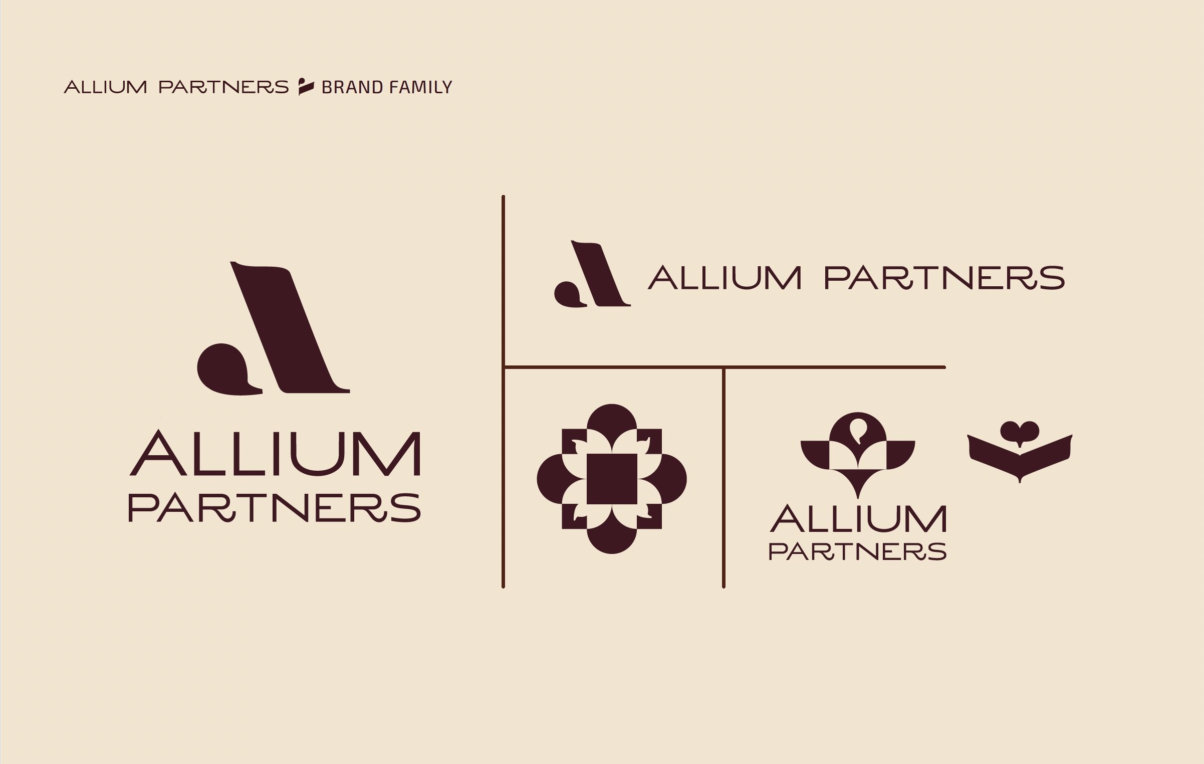
The visual identity of Allium Partners is grounded in clarity, depth, and forward motion. It reflects the brand’s role as a calm, guiding force for leaders navigating change. The design system is modern, minimal, and intentional. It creates space to focus without distraction. While the aesthetic is clean, it is never cold. Every element echoes Allium’s values: thoughtful structure, grounded insight, and room to think.
The design process began with the building of a clear visual language designed through listening. Before form, color, or typography, our time was spent understanding what is true, what is essential, and what may get in the way.
Through careful listening and structured collaborative exploration, ideas that were felt but not fully articulated were clarified and given form. The work focused on building systems rather than single expressions, creating a structure that brings clarity to complexity and leaves room to think. This visual language is a vocabulary we can use consistently across materials and contexts.
Each decision was intentional, from restraint and spacing to repetition and pattern, allowing the brand to support focus rather than competing for attention.
As we built this project together, our goal was not decoration or trend, but alignment between the mission and the message. When the system is right, the result is more than a visual identity. It is a calm, confident foundation that reflects who you are and can carry meaning forward as the brand continues to grow.
– LP Platow
LP is a creative development executive with 20+ years of product development, management, and design experience for creative consumer brands and services. Learn more at platow.nyc
On building the site
I worked with LP over a decade ago on a variety of branding projects. Her work consistently communicated the essential attributes of building a brand identity: distinct yet simple, elevated yet accessible, cohesive yet full of expression.
Every component of the Allium system demonstrates this balance. For example, the typography — Exo — is modern and distinct, yet unexpected for a consulting practice. And it’s practical: the typeface is free and takes minutes to implement in Squarespace.
My process was straightforward. I brought LP's brand package into Figma, sampled the palette for HEX codes, created component variations in different sizes and colors, exported assets, then dropped everything into Squarespace alongside the narrative Bene and I crafted in Google Docs.
It was a privilege and joy-filled process to bring this design to life.
– Lucinda Brown
Lucinda is a UX, product, and design leader in LA. You can check out her work at lucindabrown.com.